In what ways does your media product use, develop or challenge forms and conventions of real media products?
At the beginning of my project I researched the codes and conventions of film trailers. These codes and conventions included that, film trailers usually last from anything between 1:45 – 2:30 that way you get to see a decent length clip to get an idea of what the film is about and it doesn’t give too much away. I decided to stick to this convention because I wanted to make sure that people got the plot of the film and were able to see what the film is like without giving too much away. Another convention of film trailers is that the protagonist is usually shown first in a close up, I stuck to this convention partly however I also added my own twist to this and I did this by having a Skype call between the protagonist and his best friend, this way the audience see’s both characters at the same time however the protagonist ‘Adam’ is taking up the majority of the screen whereas ‘Sam’ who is the co-leading role, is in the bottom quarter, this shot therefore show’s you who the main character is and the friend who will be helping him on his journey, according to Vladimir Propp’s character theory this would make Adam the ‘Hero’ and Sam the ‘Helper’. Because my trailer is in the horror genre, I had to research the conventions of horror films and decide how my trailer could stick to or challenge those. Conventions of horrors include, one of these is that the character forgets about the threat, and this happens within my trailer as when ‘Sam’ tells ‘Adam’ about the game ‘Slender’ in which the supernatural creature in the game stalks you and kills you and that there’s been some spooky happenings with it, he doesn’t care about the danger and he decides to play the game and like in other horror films, he ended up in a lot of danger because of his ignorance, I stuck to this convention as I felt like it was a huge convention of horrors and that it was vital in all horrors and if mine was to compete against others then I would have to be able to offer what they do. This convention is also matched with that a warning goes unheeded, and within my trailer I stick to this convention again for the same reasons, the part where this happens is when ‘Sam’ says to ‘Adam’ that he definitely thinks there’s something freaky about it, however ‘Adam’ dismisses the comment and plays the game anyways, I added a little bit of a change to this convention however as the person who gives the comment, ‘Sam’, also ignores the warning as he too plays the game however it has less consequence then to what happens to ‘Adam’. A convention that I challenged was that the setting was a secluded location, I challenged this as the location of mine is in a house in the middle of the street, and although there is a very narrow alley included in the confrontation you still see that at the end it’s just another street, there is also the fact that it’s not really dark when he attacks. The reason that I did this is because it makes it look like ‘Slender’ will attack at any time, and this will put people on edge as if it can attack at any time then people will have to be ready all of the time and this in my opinion makes it more freaky and this is why I have challenged that convention.
Editing in horror films is usually slow paced to start with and then ends up fast paced and this is a well-known convention, I stuck to this convention as at first we have the Skype call were it is very slow and there isn’t much going on, we then get the scene in ‘Sam’s’ bedroom which gets a little bit faster and after that we get the action clips which are a lot faster paced and end with a slower piece of editing which builds up to the big scare where ‘Slender’ goes at the comment and there is the loud sharp noise which accompanies it which adds to the scare.
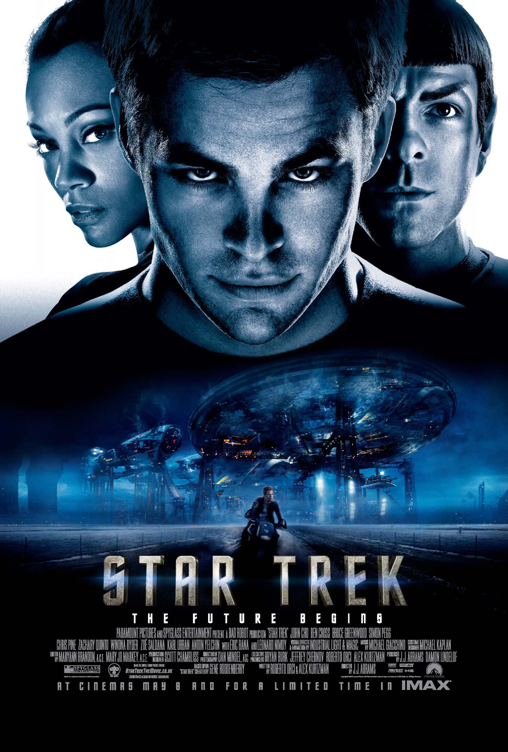
When looking at conventions of my ancillary texts, I decided to follow a lot more than what I challenged, one of my ancillary texts was my film poster, conventions that I followed with that included, the main actor’s names in large text, I did this in order to coincide with other products and so the audience knew who was starring in the film. Another convention that I followed was that the title of the film is shown about a quarter up the page from the bottom and is made to look bold and very easily visible, I have done this because it will get the audience to look at my film poster and straight away they will know the name of my film and it will get them interested and will boost the amount of people that will want to see this. Another convention I followed was images that took up the majority of the page and in my poster there is the protagonist and the antagonist (again this is a convention I followed) and they are both very large images and take up at least three quarters of the page. I did this as like with the names it shows the audience the characters of the film and it will get them more interested as they will have an insight as to what the film might be about.
How effective is the combination of your main product and ancillary texts?
I think my products combine very well; my main product obviously explains what the story is about and what you could expect if you were to see the whole movie. My ancillary texts don’t provide as much information as this however you can get an insight as what to expect as they have the protagonist and antagonist which is featured in all three of my products which does make them combine well, combining all three of them by using the protagonist and antagonist is what I did as that is the main link, anything to do with the trailer should include the main characters of the film as that is what it is all about. Another way that my products combine is that they include the same techniques such as the text in both of the ancillary texts and at the end of the trailer is all the same and this links all three products together even if people don’t pick up on it, it still links them all together and people will probably pick up on it sub-consciously so if they see that text it will remind them of my products which will reinforce them to watch my trailer and look forward to the film. One thing in which the trailer and ancillary texts aren’t linked is that, the trailer is in colour however my ancillary texts are in black and white, this could send out mixed messages as people may think that the film is in black and white when really it is in colour, I took this into consideration when I decided to do this, however I decided that it wouldn’t be a huge risk and went ahead with it, this is because I think it makes the poster and magazine much more effective as it makes them look more freaky which is what the film is all about.
What have you learned from your feedback?
The feedback that I have got is from many sources, I have focused it mainly on my target audience which is the 16-24 age range however there is also some feedback from other ages. Some of the feedback I got was positive and some of it was negative and included things that I could improve on, one comment I got was about the northern accents of the actors which they said made them ‘laugh more than scared’ however when it got to the action bits they did find it ‘very good’, this made me think that if I had the chance to get different actors in who didn’t necessarily have such strong northern accents then I could have done that, or I could have got the same actors to try and put on a voice that sounds a bit more neutral so that it didn’t interrupt the film. Another piece of feedback I got said was the tweet by Emily Charlotte @MissLittleFeet, it says that it’s good and to make the aspect ratio wider so it fills the screen, I asked for feedback when I had a bit of trouble with the screen and making the trailer fit the full screen however it is now sorted so I took that piece of feedback and corrected my error. Another comment that she made was to add more close ups. I agree with this as my trailer includes a lot more mid shots and long shots rather than close ups; however I feel like there are a few shots which start off as long or mid and end up as a close up. If I had the chance to reshoot however I would put in a few more shots which were closer in to show off the emotion of how terrified the protagonist is. Emily also said that the soundtrack and the plot was very good, this is great feedback as she has highlighted specifically what she enjoyed most about the trailer. I got two more pieces of feedback off Twitter and these were from Phil Harrison @SilverTigerPhil and his said Great trailer, can’t wait to see the movie #DeNiro, this is positive feedback however it is very broad and doesn’t specify what is good about the trailer so although it is feedback I can use it isn’t great help. I also got a tweet that was very similar to that which was from Chris Jennings @chrisjennouk which said #Decent well done #Spielberg, this again was positive feedback which I could use to say that people enjoy it however it doesn’t have specifics as to whether people enjoyed a particular stylistic or a specific shot, this means it’s not a huge help. I put my trailer on Facebook as well which received 7 likes, which means that 7 people had watched my trailer and felt it was very good. Feedback that I received for my ancillary texts included 11 likes on instagram when I posted a picture of my film poster; this means that they all thought that my film poster was good however nobody left any feedback. When I asked my class to rate my film poster 23 people out of 26 all agreed that they would rate it a 9/10 which is very promising and is very good feedback, some of the comments they left included, “I like that it’s in black and white, very spooky!” another comment said “The way you’ve got the gun to point at the audience is very effective and gets them involved straight away”. This overall was great feedback for my film poster. I did the same thing with my film magazine however 22 out of 26 this time said they would only rate that a 7/10 this isn’t as good as my film poster however it is still good, some of the comments that were left for this included “It doesn’t look as professional as it could do.” And also “It looks a bit to crammed.” If I were to change my film magazine I would re look at it and see whether there is anything I could take out in order to free up some space and try and I would look at more magazines and try and get mine to look as professional as there’s.
How did you use new media technologies in the construction and research, planning and evaluation stage?
When constructing my product I used many pieces of technology, the first piece of technology used when constructing my product was a Sony HD camera which the college let me borrow. I used this camera to film the whole of my film. I had the choice of the camera I chose or the choice of two other little cameras which just used memory cards however the camera I chose to use picked up sound better so therefore since I had dialogue within my trailer I decided to use one of those. Whilst filming I also used ‘Skype’ which is a media technology which is used by friends to contact each other this is how it is used in my film trailer. Another media technology that was used during the construction of my trailer is adobe premiere pro CS4 which is an editing programme which I used in order to put my trailer together along with the sound. I used this system as it allows for many different uses of the videos; it has many different video tabs so that you can use more than one video at a time. It has the same with the sound as well; it also has many different effects such as transitions that can be featured within the product you’re making. The media technology I used during my construction of my ancillary texts was a digital camera which was used to take the images that are featured on my ancillary texts. I then adobe Photoshop CS5 which is an image editing programme, I used this in order to manipulate my images so that they would look perfect when I put them onto the product. It also allows for airbrushing so I could airbrush anything that wasn’t perfect and I could also remove anything that wasn’t meant to be there. Media technologies I used during my research and planning included the internet and many different search engines which I used in order to find my planning, I used many different search engines as I wanted to make sure I looked everywhere to find the right research and planning. During the evaluation stage I used Microsoft word to write up my evaluation. I also used media technologies such as social networking E.g. Facebook and twitter when I was getting my audience feedback. Other technologies included an iPhone in which I used in order to get screen shots of the feedback that I got on the social networking sites, I then used the iPhone to transfer the images that I had screenshotted onto the computer and I then transferred them into my evaluation in order to show what feedback I got.